

My “next week” got pushed back quite a bit given the stress of Summer Reading Program preparation, and then I got to participate in the amazing “Show Me the Awesome” initiative!
But I’m back with more information about Picture Book City! This time, with several more pictures of signs in the neighborhoods.
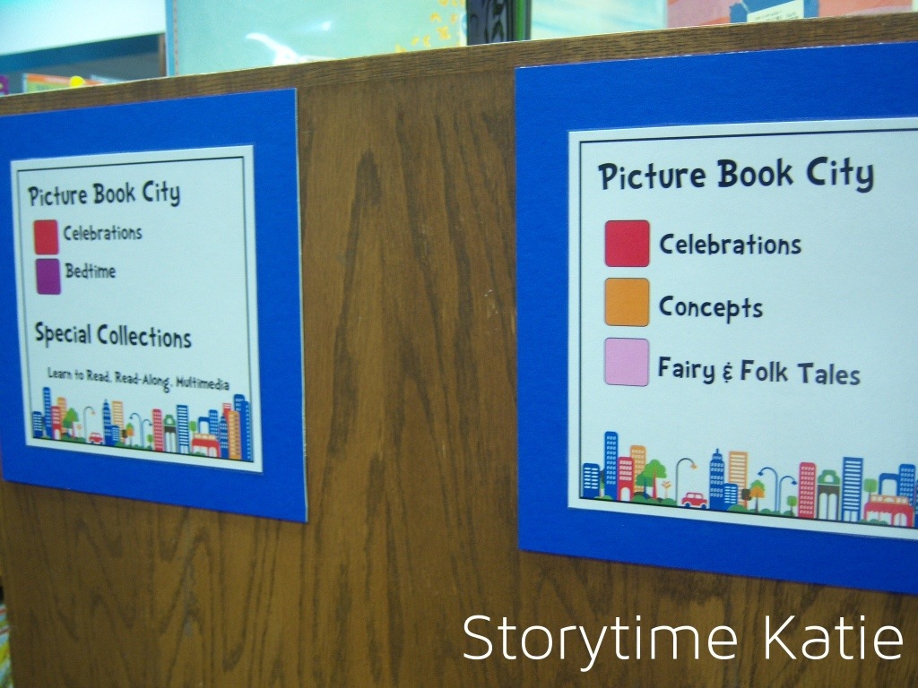
The endcap directional signs. On the other side, they run backwards — in the order that a patron would see them if they walked in from that side of the stacks.
I love using the endcaps signs when I’m taking patrons through Picture Book City. I’m very intentional in how I answer reference questions since I want the organizational system to be transparent. For example, my narrative as I show patrons where the Dora books are might sound something like this:
“We changed how the picture books are shelved. All of the books with the blue sticker (points to endcap blue) are in the Favorites neighborhood, where we shelve all of friends like Dora, Disney, Spongebob.”
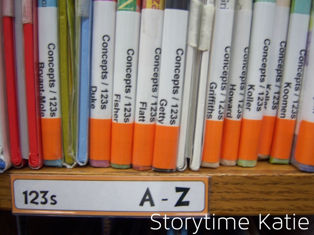
The shelf labels! We went with patron friendly language here. The orange color already indicates “Concepts,” so we listed the street on the label.
The shelf labels are mostly to help our clerks and pages re-shelve correctly — they are adjusting to PBC, too — but it also looks so clean and nice and organized. It makes my librarian heart happy.
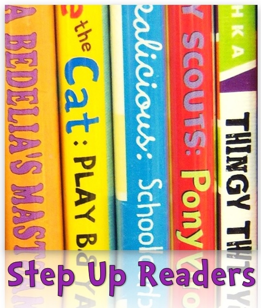
A full section, with signs!
Overall, I’ve been ridiculously happy with the signs and their reception by patrons in Picture Book City!
Next time, I’m planning on posting the final list of neighborhoods/streets & including the information sheet that we have available in the Youth Services area for patrons to use!


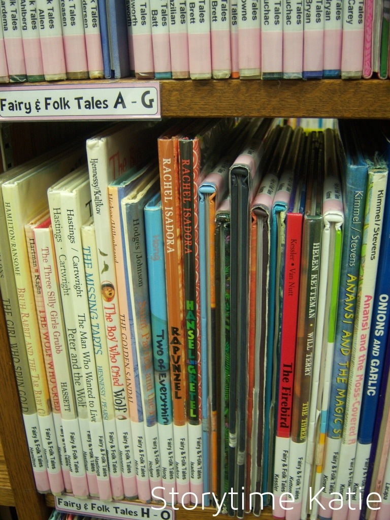
With folk tales, did you move all the 398s into picture book city?
Yes! We kept collections in 398s, but moved individual stories into the neighborhood!
I’m super impressed with what you’ve done here!
Thank you!
i cant wait to see your full list of the neighborhoods you made to catagorize your books