

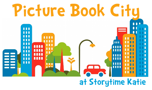
One of my biggest concerns and thoughts about re-organizing the picture book was that I really wanted to make it very clear to patrons that this change was about them being able to find their own materials. To help them in that endeavor, I knew that we needed to put up lots and lots of signs.
Here’s a few pictures of the different kinds of signs we’ve done:

Our overhead sign, hanging from the ceiling.
I made this sign in Publisher and my fabulous co-worker backed it with poster board. It looks beautiful (despite the awful fluorescent lights in the picture) and it really pops in the department.

Signs in the bookcases, at the beginning of each neighborhood.
This one is from the Bedtime neighborhood.
Another Publisher file that I worked on. I color-matched the heading to the color of the label, hoping for good color recognition by our patrons.
Right now, we’re working on more signs for Picture Book City after sitting with it for a month to make sure we weren’t moving everything all over again. This week at the library, I’m making endcap directions and my co-worker is working on individual shelf labels.
I’ll post pictures of those next week!


Cute signs!
Thank you!
Great signs, Katie! May I ask what font you used for them? I really like it.
I’m so sorry, I missed this comment somehow! We used Doctor Soos Bold, which was downloaded from http://www.dafont.com years ago for a Dr. Seuss program.
That sign really pops! I love it.
Thank you. It makes me smile whenever I stare at it.
I love this idea! Do your patrons get the concept of ‘neighborhood’ and ‘street’?
Neighborhood, yes. Street, not so much. But we also haven’t really publicized “street” as part of our terminology.