

This post is LONG overdue, but as soon as I had written it, we had to change everything in the catalog and start over!
There were a lot of questions about how we were going to display the call numbers in the catalog. We are very lucky that we have almost complete autonomy on what we can list in the catalog, as far as number of characters etc. And we thought that we wouldn’t have a problem including the slashes that we use on the book spines. So, that’s the direction that we first went with:
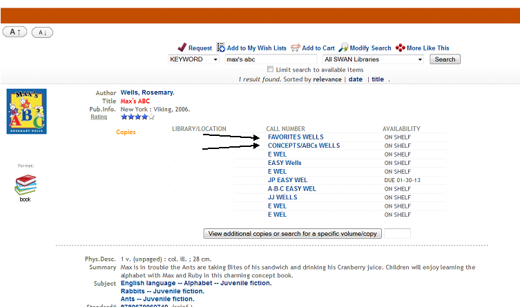
My library’s copies are the first two listed.
(You can see that some of our multiple copies got split up between neighborhoods!)
I loved how this looked in the catalog. I thought it was very clear that the neighborhood and street were linked. My staff members had learned how to read the calls again, and patrons were giving us positive feedback.
…
And then we ran a report.
And those sweet, beautiful looking slashes messed up how our reports were run. And we had to get rid of all the slashes. Now, our catalog looks like this:
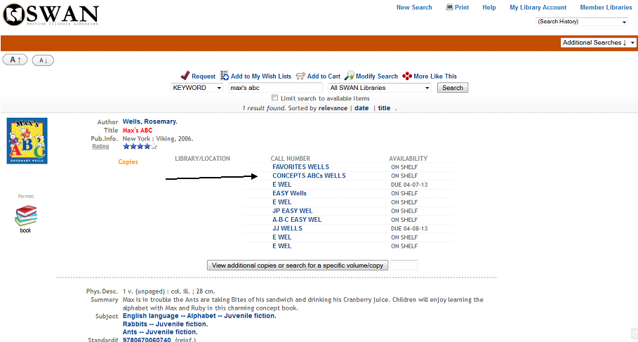
Still functioning, but I miss those slashes.
Staff and patrons have adjusted from this change (we made it about a month ago now), and everyone is still able to navigate without the slashes. I will likely always miss the look of them, but understand and support letting them go for functionality.
Next up, signs in Picture Book City!


Leave a comment